
Loading the latest stories…


How the colors of your warp and weft interact often has nothing to do with the colors themselves. Find out how sett, luster, and weave structure all affect the final cloth.
Sara C. Bixler4 min read
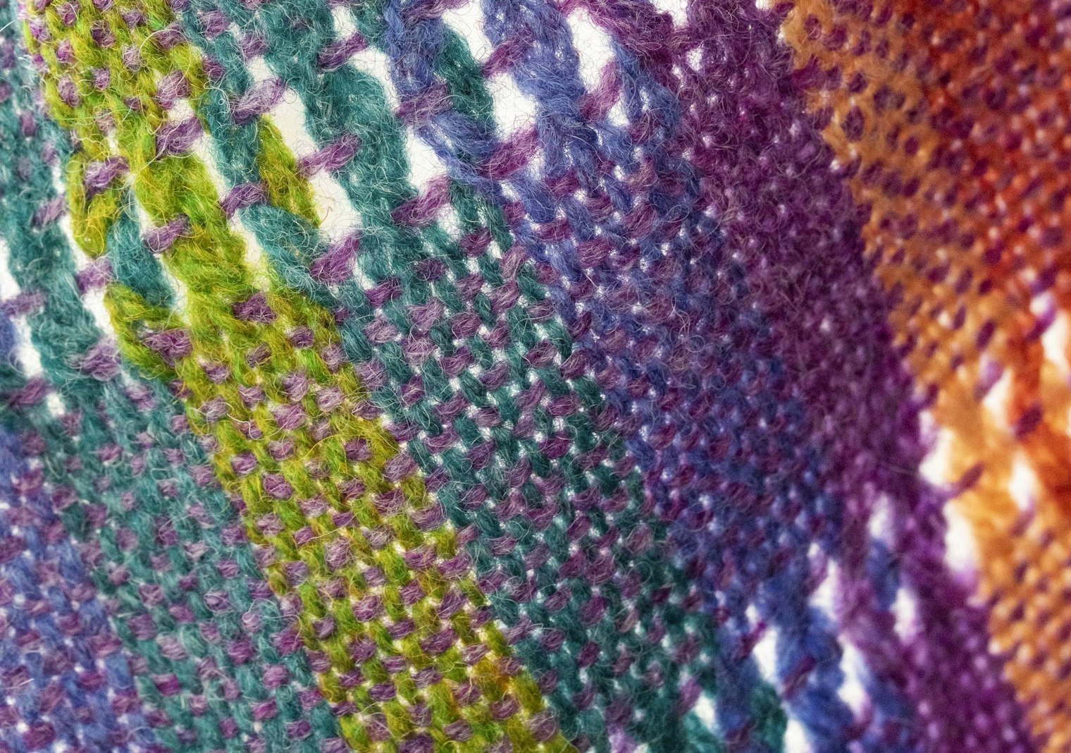
This is a color theory article that doesn't talk directly about color. In weaving, how well colors mix on the loom comes down to more than just the palette—yarn choice and weave structure play an equally important role. In her article, originally published in the Summer 2017 issue, Sara Bixler talks about how these choices can dramatically affect the way colors interact on the loom and in your final cloth. To learn To learn more from Sara about color, specifically color-and-weave on the rigid-heddle loom, check out her course Color-and-Weave on the Rigid-Heddle Loom. —Christina
It happens to all of us at some point or another: someone asks a question out of the blue that catches you off guard. I experienced this recently while working in the office with my husband, Dustin. There we were, plugging away on our respective computers, when he turned to me and asked, “When you go and give presentations to weaving guilds on color, what exactly are you talking to them about?—Are there really that many people who are interested in color theory?”
For many weavers, color theory is the most challenging facet of the design process. So much of what is written on color theory specifically targets artists using mediums such as paint, paper, and dyes, but there is very little on how color is used in weaving. Why is this so different for weavers than other artists? It has to do with how the colors play with one another.
It’s true that red and yellow make orange when you are physically mixing pigments on a painter’s palette, in the dyepot, or even with food coloring, but on the loom it’s not possible to physically mix threads together. When working with two or more colors during the design process, it’s important to anticipate how those colors will play with one another. I find it helps to keep a few key concepts in mind when choosing colors for each project.
Very thin threads mix very well optically. In simpler terms, from a certain distance away from a fabric woven using fine threads, the human eye has a hard time differentiating between the warp and weft colors. For example, if the warp is red, the weft is yellow, the epi and ppi are both relatively high, a viewer at a relatively close range would perceive orange. A relatable example within the fine art world is the Pointillist work of Georges Seurat: up close, you can see each individual dot, but when you stand back, the magic is revealed.
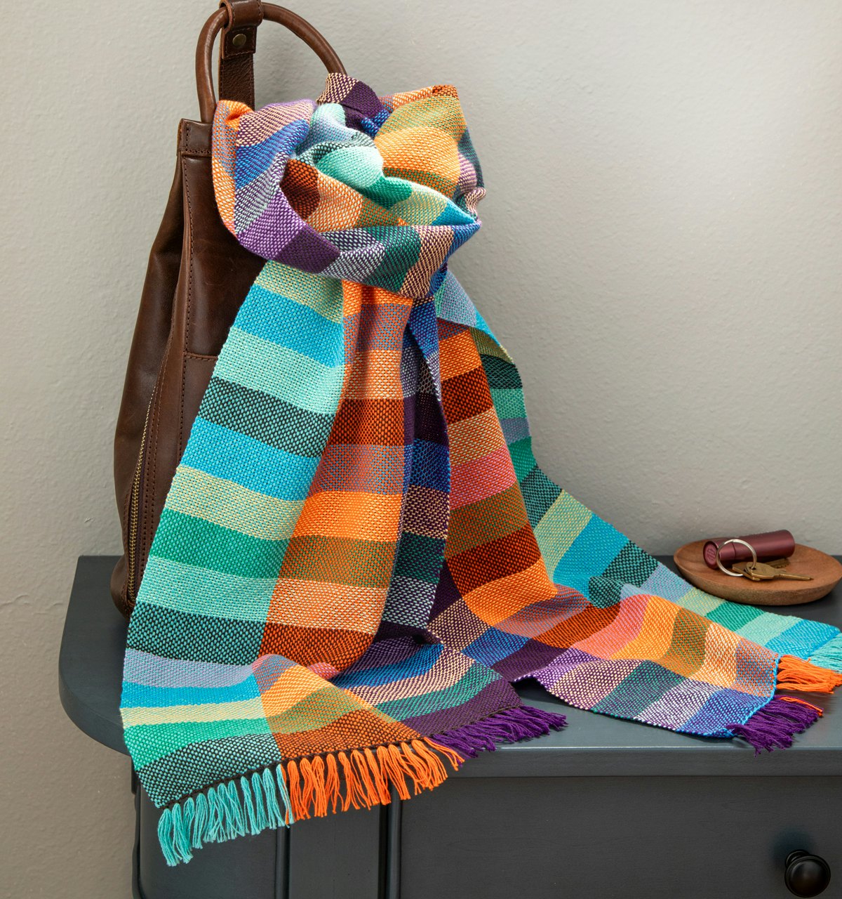
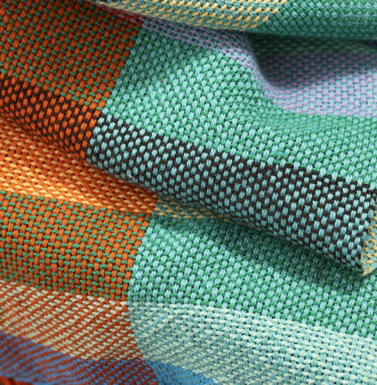
For her Urban Grid Scarf from Summer 2026, Jennifer E. Kwong sett her warp at 12 epi and her weft at 15 ppi. While her colors appear to mix when viewed from afar, the distinct colors of the warp and weft remain visible when viewed up close. Photos by Matt Graves
In contrast, looking at a dramatically larger thread (such as a thick wool yarn sett at 8 epi), viewers can pick out the two different colors simply because of the large physical size, unless they stand a considerable distance away.
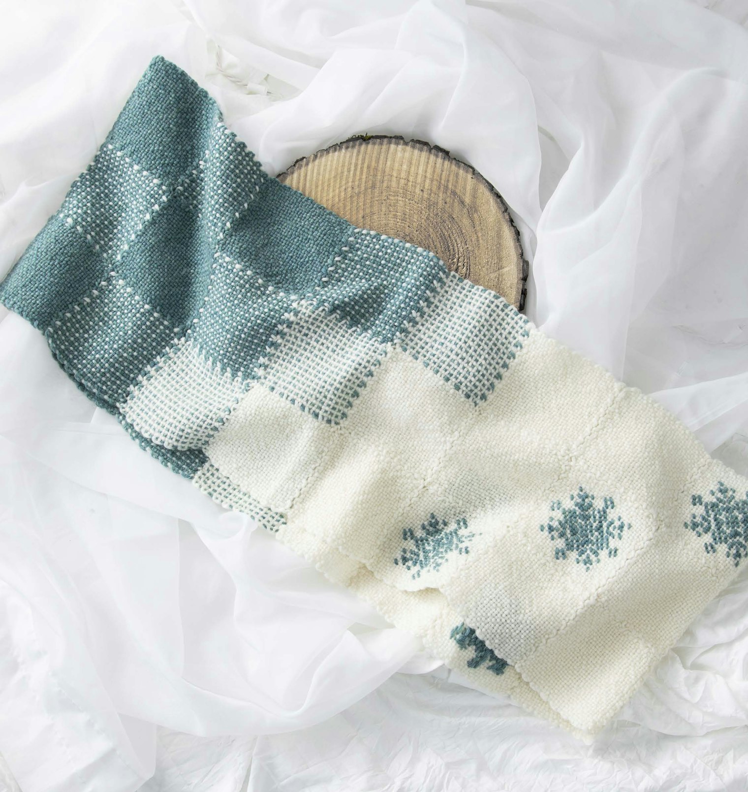
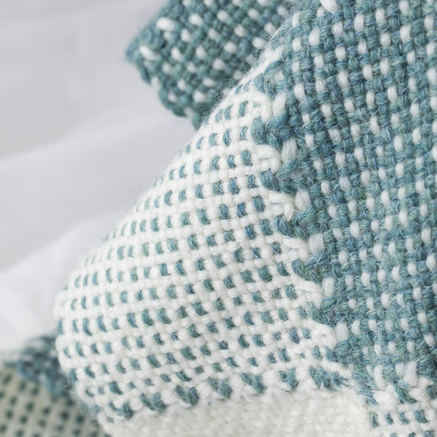
Jana Ford used two colors in some of the pin-loom squares for her Snow Queen Snood. Because her yarn is sett much lower than 20 epi, both colors are clearly visible in these bi-color squares, even when viewed at a distance. Click each photo to get a closer look. Photos by Matt Graves
Threads that appear shiny reflect light differently than those that are matte or coarse in composition. Shiny threads more readily trick the eye than matte threads. Woven douppioni silks have a beautiful iridescence. Turn the fabric in one direction and it’s purple; turn it in another and it’s red—magic! This would be somewhere between difficult and impossible to achieve with matte yarns, but woven iridescence can be produced with shiny yarns such as silk, Tencel, rayon, and even mercerized cottons.
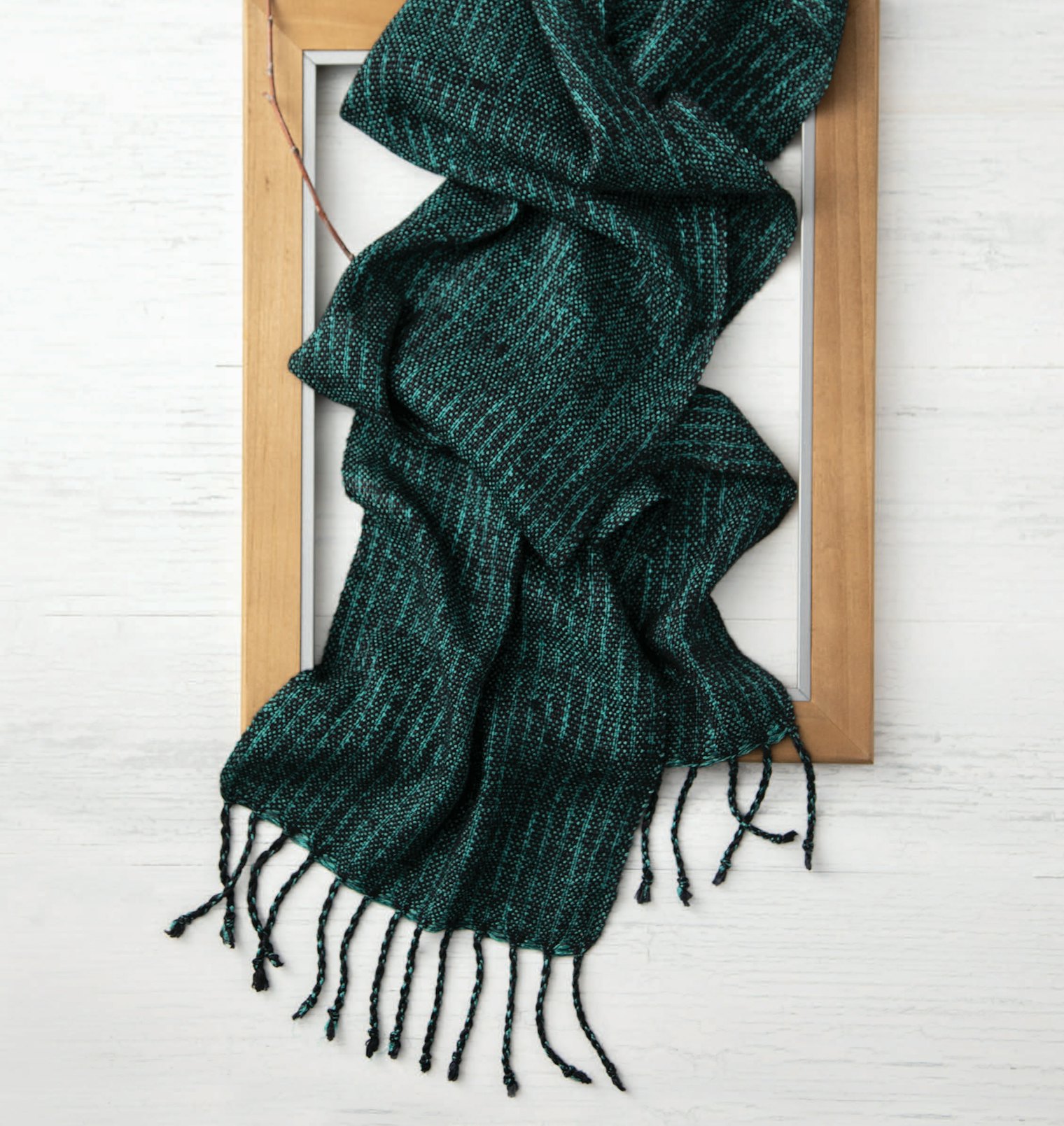
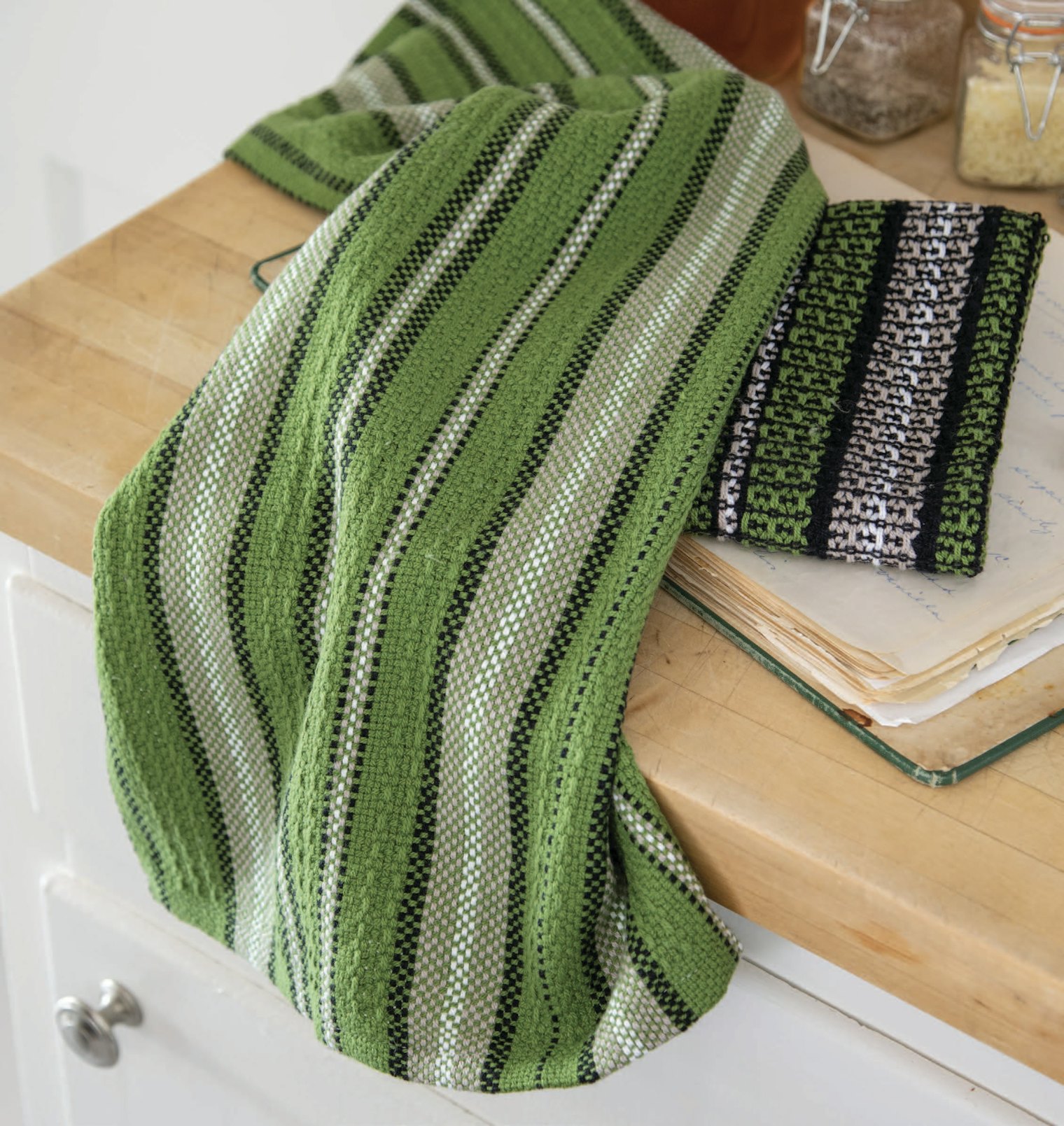
Both of these projects have similar palettes; however, the colors present differently—and it's all down to luster. For her Glaowing Emerald Scarf, Lindsay Wiseman chose yarns with a high luster, so her scarf reflects light. Tammy Bast used a matte cotton yarn in her Modern Stripe Tea Towels, so they diffuse rather than reflect the light. Click the photos above to get a closer look at each fabric. Photos by Matt Graves
Using a balanced weave such as plain weave produces an equal representation of colors in both warp and weft. In contrast, when a structure or weaving technique results in longer floats—individual threads that travel over the surface of the fabric—the eye may not be able to mix the two colors together as easily. Keep this in mind when working with inlay, pick-up, and some hand-manipulated laces. It may be very important, especially if you want to “show off” a special yarn in the warp or weft.
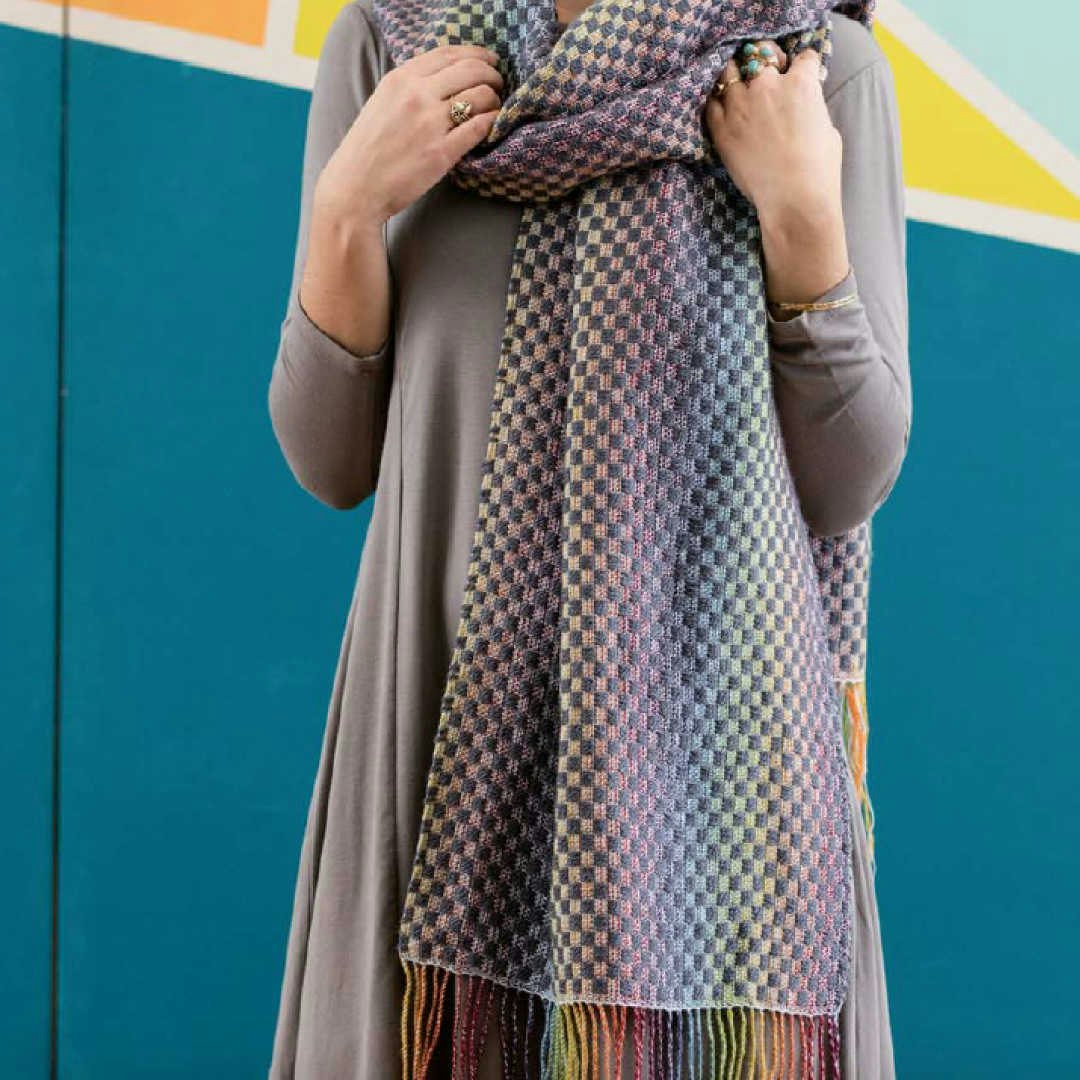
Weft floats created with a pick-up stick in Sara’s Rainbow Connection Shawl from Little Looms 2017, bring the colorful Kauni yarn to the fore, making it the center of attention and keeping it from getting muddy. Photo by George Boe
While this just scratches the surface of color theory for weavers, these simple rules and points of consideration can help weavers both new and experienced. Taking them into consideration during the design process will help ensure that the woven cloth comes out as planned and eliminates at least some of the unknowns.
Be bold, take risks, and learn through color exploration. It’s a fun journey.
First published 6/30/2022; updated 5/26/2026
More from Little Looms
 From WIF to Woven ClothLearn how to use WIFs and weaving software to create and edit patterns—before you put a single thread on the loom. Christina Garton · July 23, 2026
 Designing Borders for Pick-Up BandsLearn tips and tricks for designing borders for your pick-up bands, from simple stripes to more complex color-and-weave designs. Christina Garton · July 2, 2026
 A Trio of Table ToppersGo beyond rectangular runners with table toppers. Christina Garton · June 30, 2026
 Roll the Dice on Your Next DesignFind out how easy it is to kick-start your creativity when you leave your design choices up to chance. Tommye McClure Scanlin · June 9, 2026
 Dealing with Selvedges that Go BumpLace weaves are notorious for creating uneven, scalloped, and overall lumpy-bumpy selvedges. Learn two different methods for handling these selvedges in the first installment of our Summer Selvedge Series. Christina Garton · June 4, 2026
 Up Your Design Game with the Fibonacci SequenceLearn how easy it is to design beautiful, asymmetric patterns using a simple bit of math. Christine Jablonski · April 21, 2026
 Choosing Yarns for the Pin LoomBenjamin Krudwig · March 17, 2026
 Weave Tiny Masterpieces Anywhere with Sketch TapestriesFind out how tapestry weaver Rebecca Mezoff captures moments in small-form weavings she calls sketch tapestries. Learn her design technique as well as what she keeps in her to-go kit for weaving anytime, anywhere.Rebecca Mezoff · February 17, 2026
 Make a Gamp—Without Weaving!Color gamps are useful tools in weaving, but they take time, lots of yarn, and can’t be rearranged. Instead, try Jennifer E. Kwong’s genius weave-less gamps to help you choose colors before weaving.Jennifer E. Kwong · October 2, 2025
 Weave Brilliant Inkle Bands with GradientsLearn how designer Julie Beers uses colorful cotton yarns to weave bands with colors that blend together beautifully. Julie Beers · August 28, 2025
From the Library


Comments
No comments yet — be the first to share your thoughts.
Sign in to join the conversation — commenting is for signed-in members.